Nembo is a box of learning games — numbers, geometry, logic — for children who are just starting to read. The identity had to carry that promise before a parent picked up the box.
The easy route was obvious. Bright colours. Cute shapes. A brand that looked playful but was built like everything else.
Instead, we let the games themselves draw the brand.
If the product is a game,
the logo should be a board.
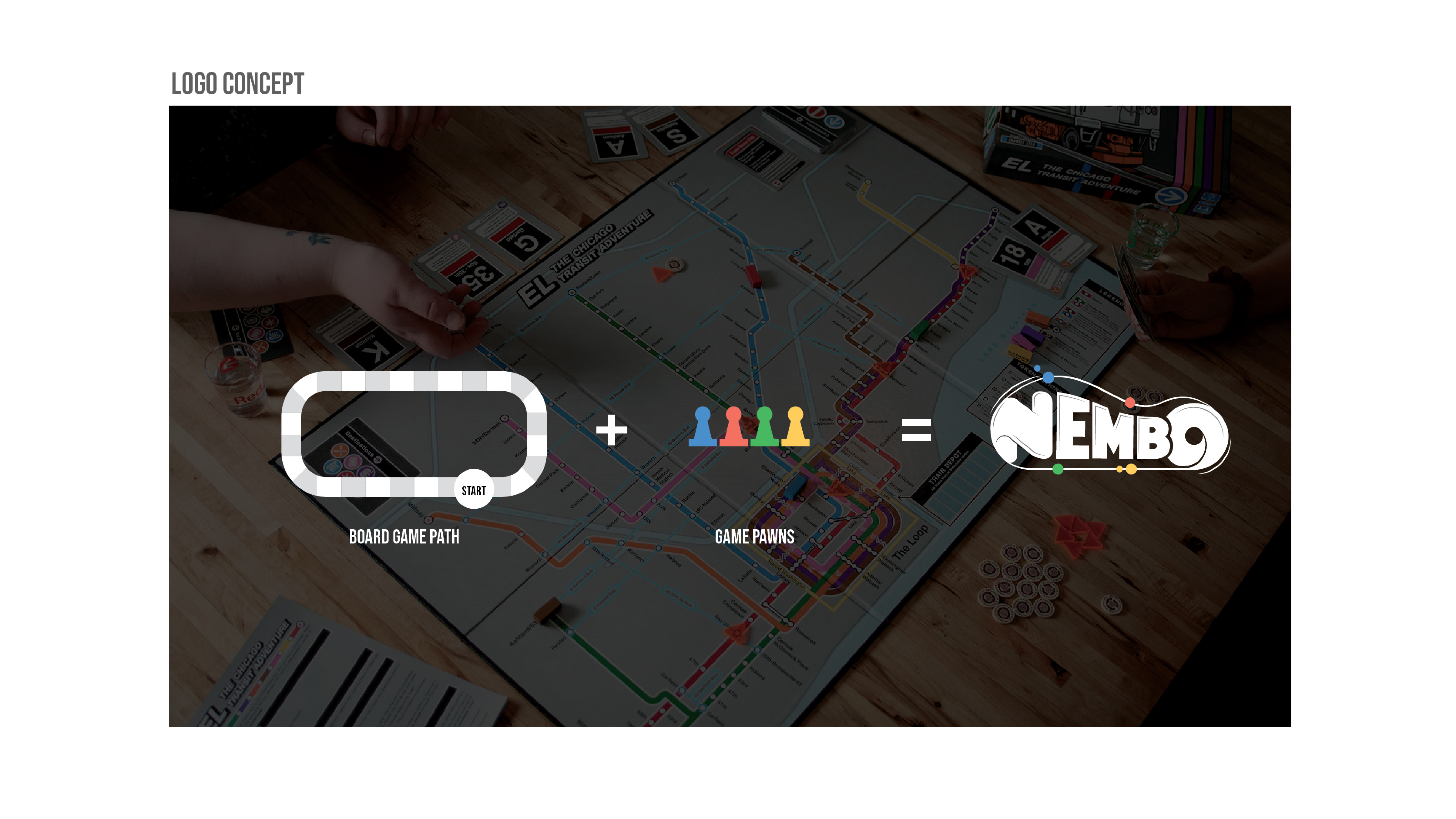
The construction is right there in the concept sheet: take a looping game path, add the pawns that travel it, and let the track bend itself into letters. The wordmark is literally a playable route.
The logo formula ✦
Around the mark sits a shape language of rounded pills and counters — the same geometry as game pieces — in a primary palette of blue, green, yellow, and red. Nothing decorative; every shape is a piece you could pick up.
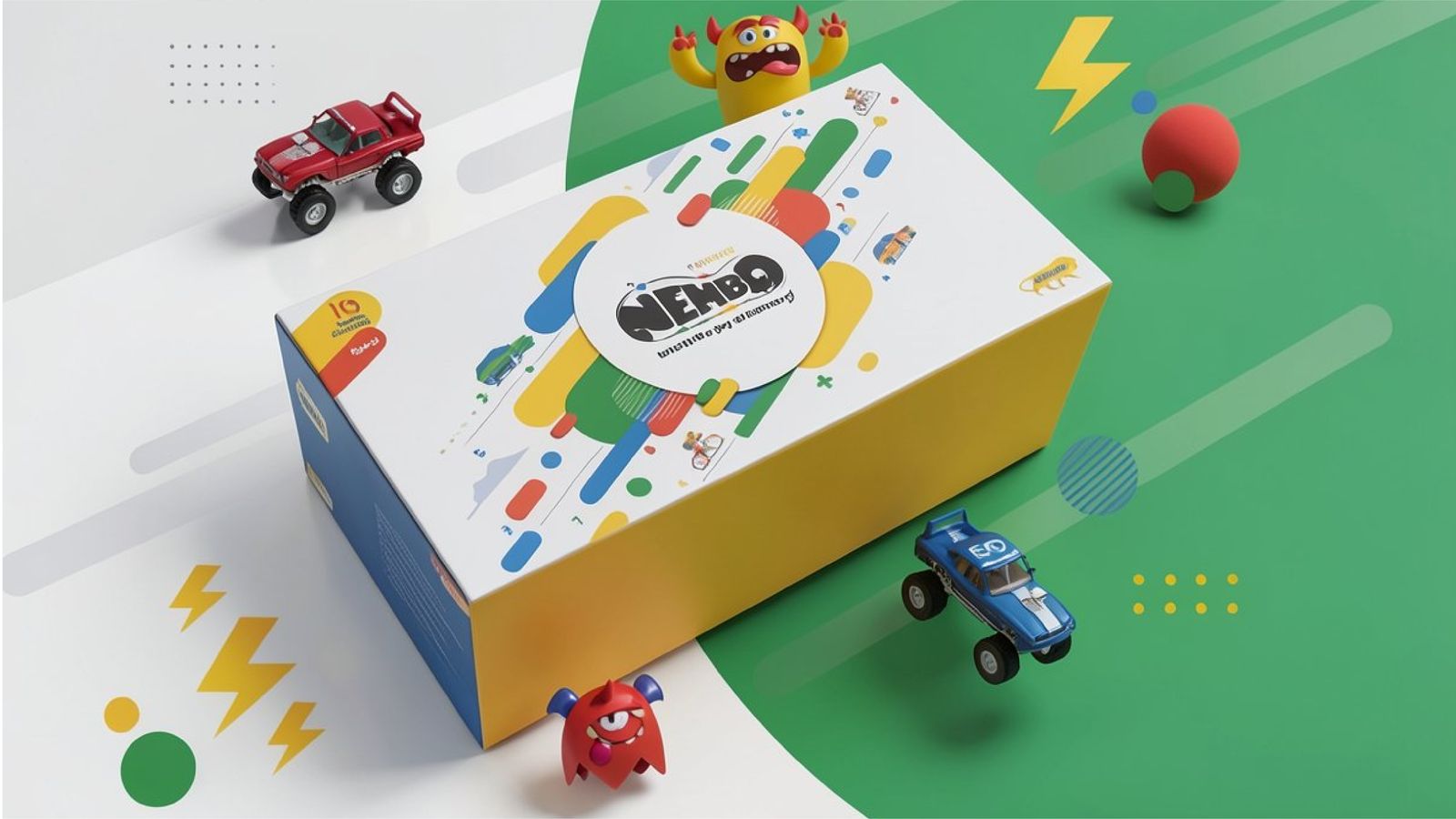
For a shelf product, packaging is the brand's biggest canvas. The pills scatter and stream diagonally across the lid, so the box looks mid-game before it is even opened.
The white circle at the centre keeps the wordmark calm inside the motion.
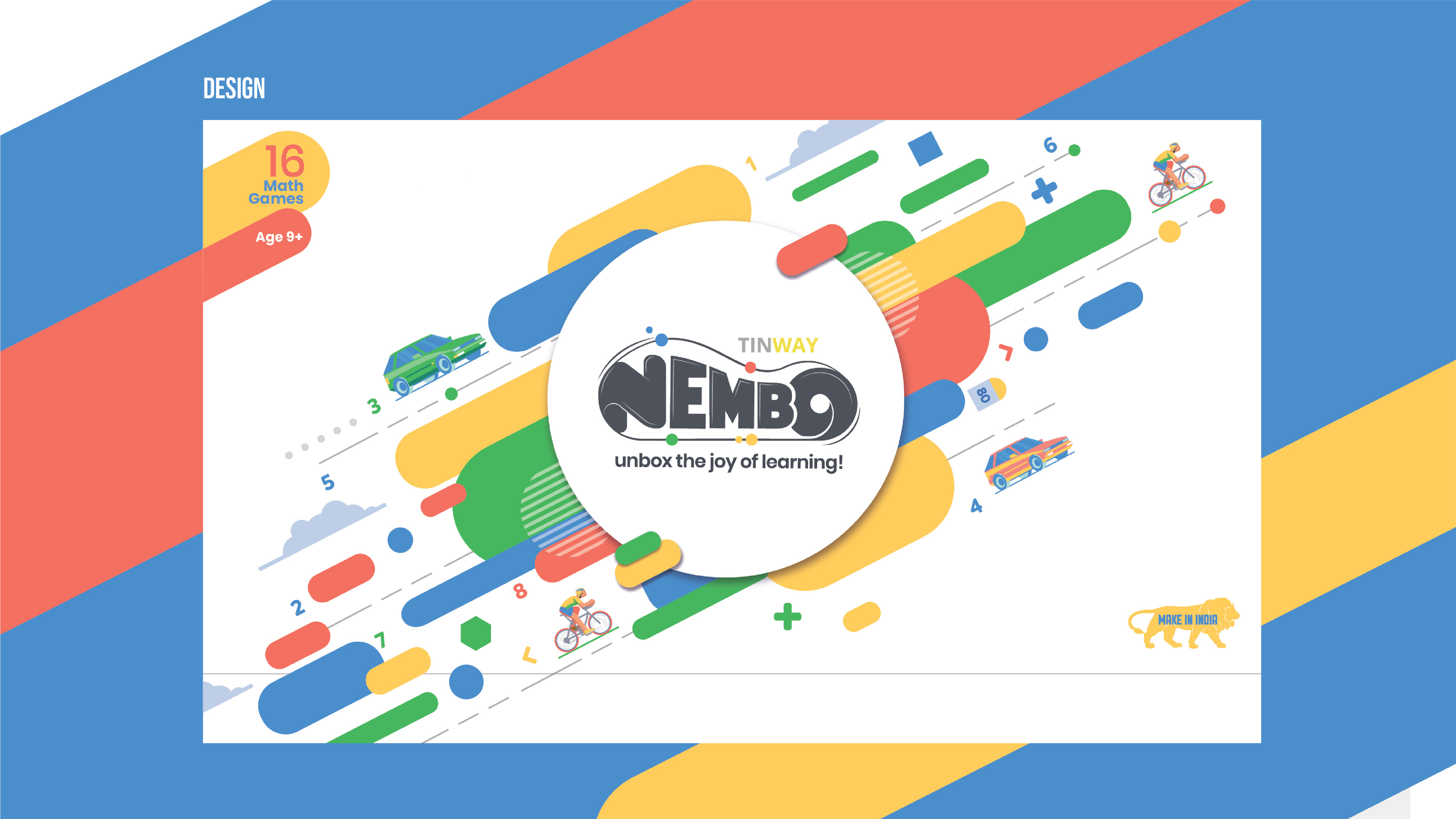
The dieline · every face of the box carries the system
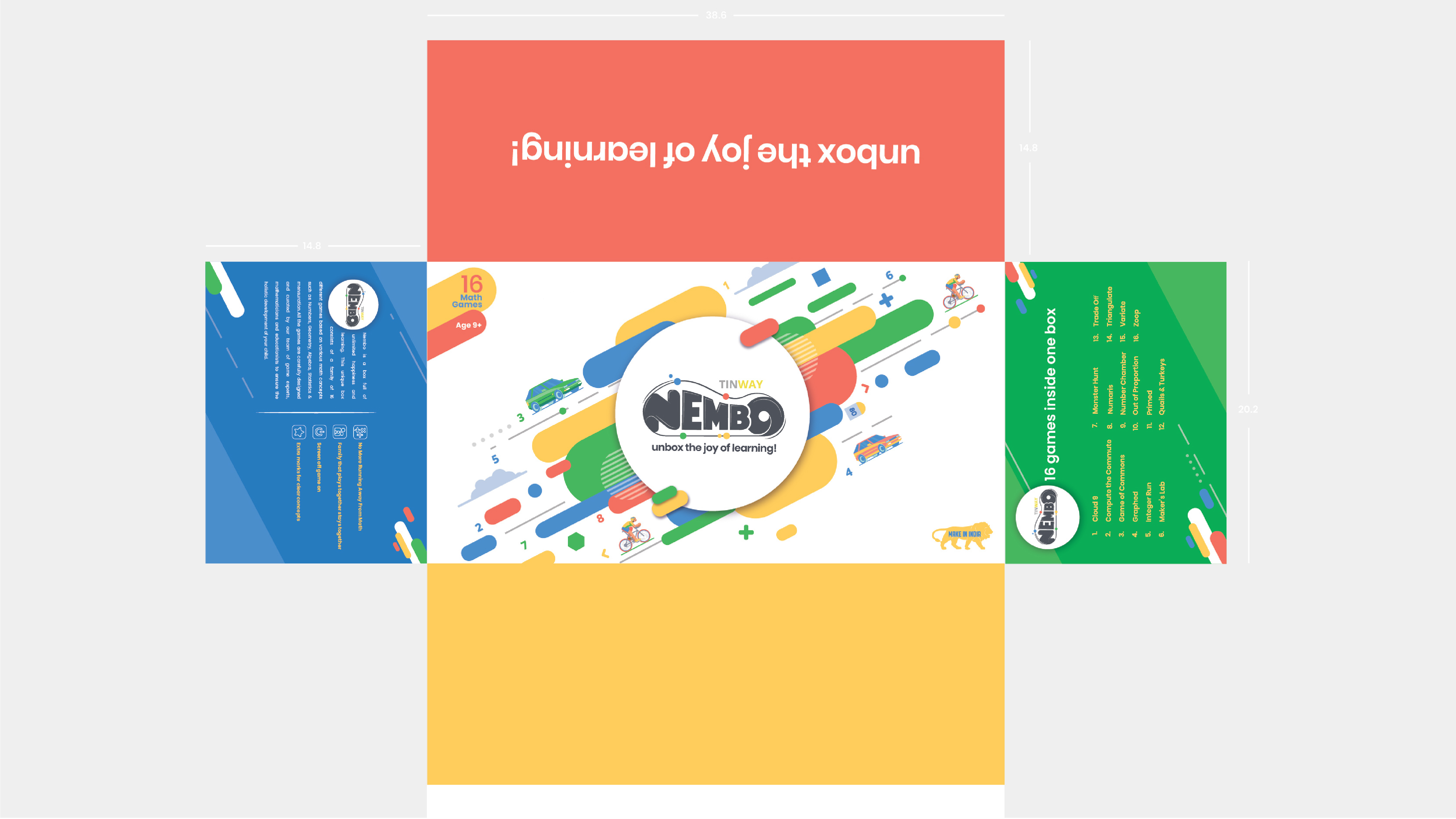
What should a learning-games brand signal? We wrote the visual rules first: primary colours, rounded geometry, motion on every surface.
Path, pawns, letters. The logo concept came straight from the product, so it explains the box the moment it is read.
Dieline, manual, and activity cards built from the same kit — so the brand arrives assembled, straight off the shelf.
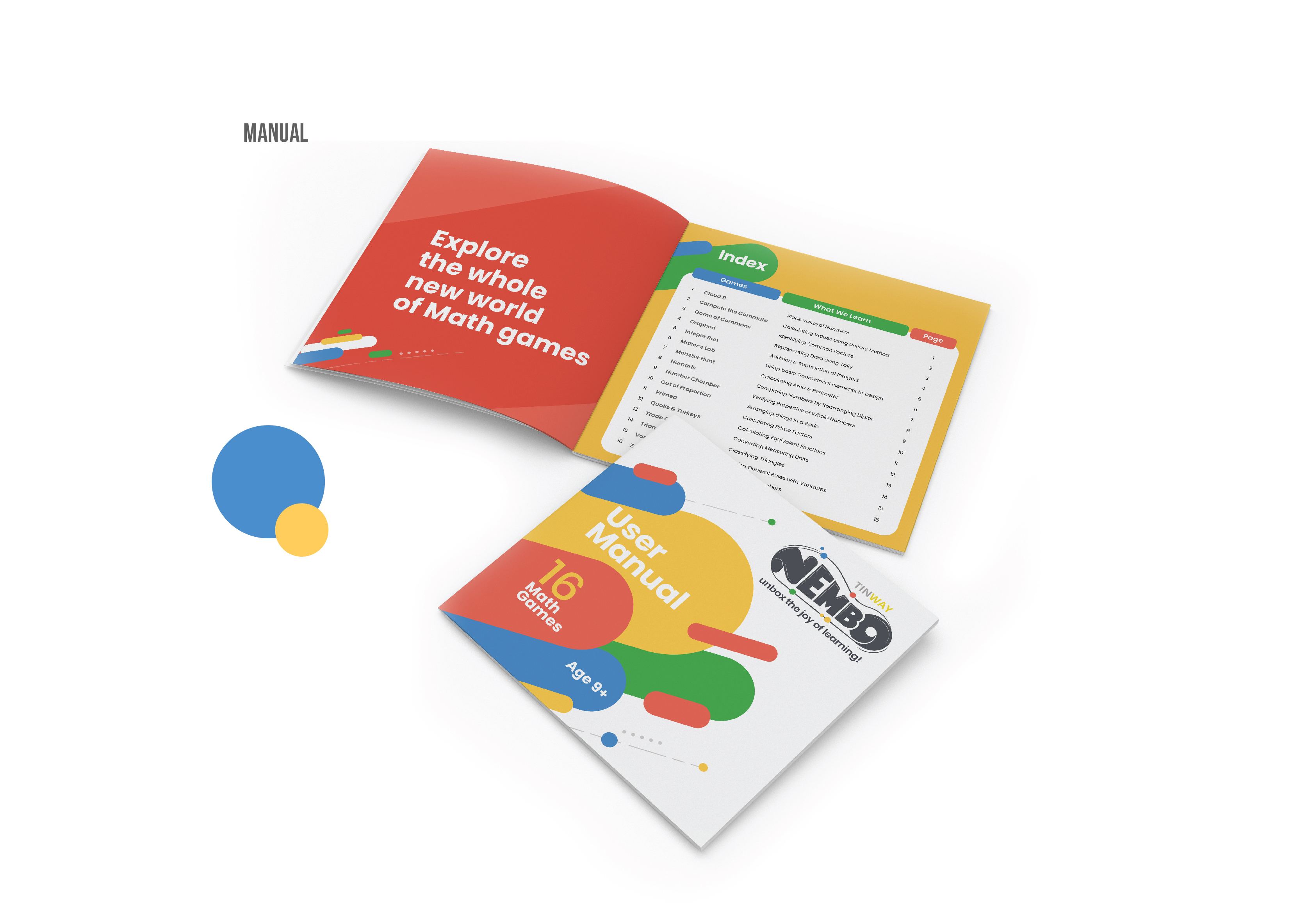
Nembo · the complete experience