✦ ✦ ✦ Identity · Dining & lounge

A speakeasy,
dressed for
dinner.

Client Blind Tiger
Category Branding · Hospitality
Output Identity · menu · tableware
Format The dining room & lounge
A FLUID® case study
Identity · Pattern · Touchpoints
Chapter 01 An old name, a new room
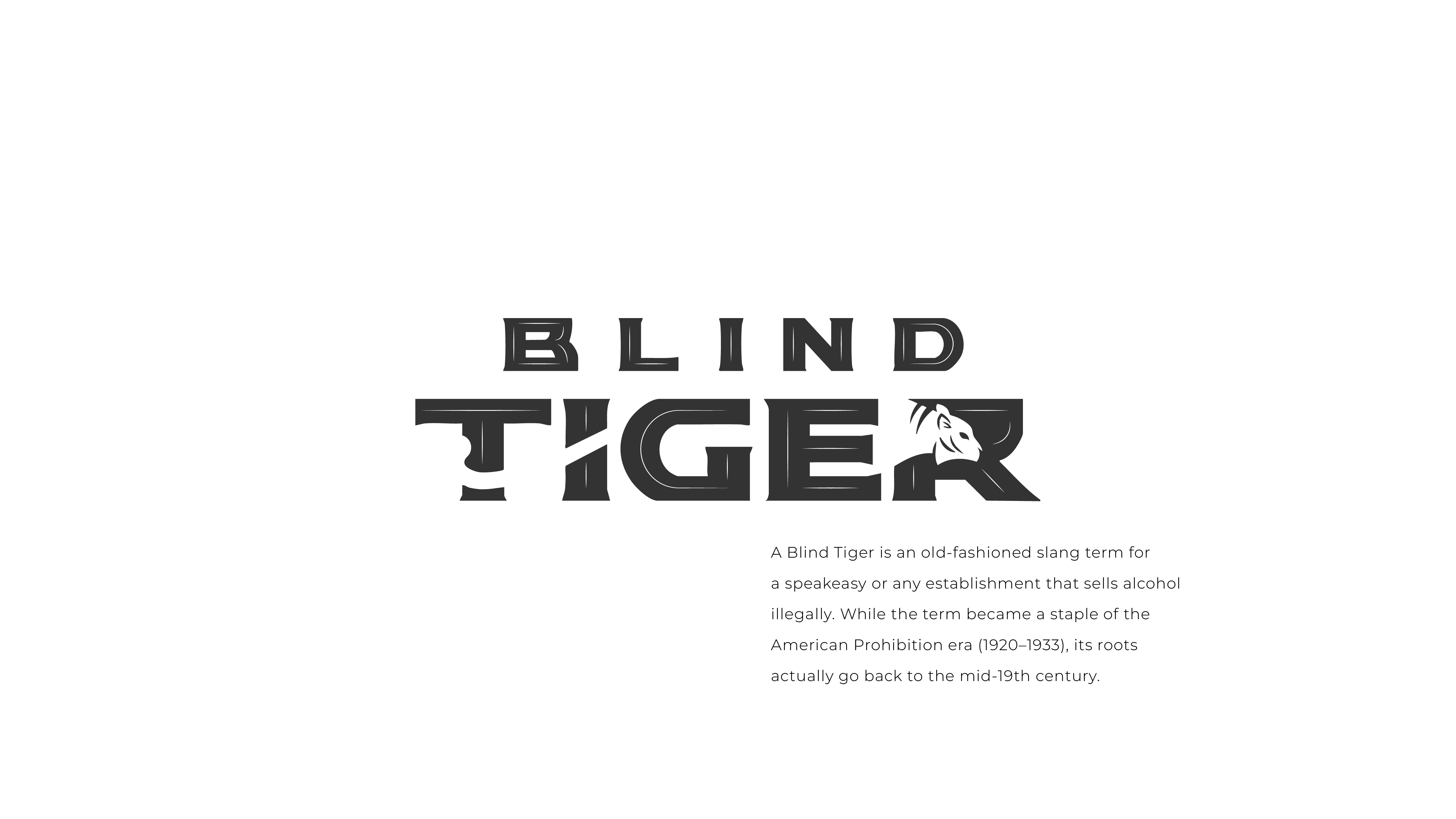
Blind Tiger wordmark with definition of the term

Blind Tiger · the name, defined

A Blind Tiger was an old slang term for a speakeasy — an establishment that sold alcohol illegally during the American Prohibition era of 1920 to 1933.

The name did not need explaining. It needed a room that could carry it.

A speakeasy mood, translated for dinner.

"

A name with a past.
A room with a pulse.

The brief, in two lines
Chapter 02 The mark, and the room around it

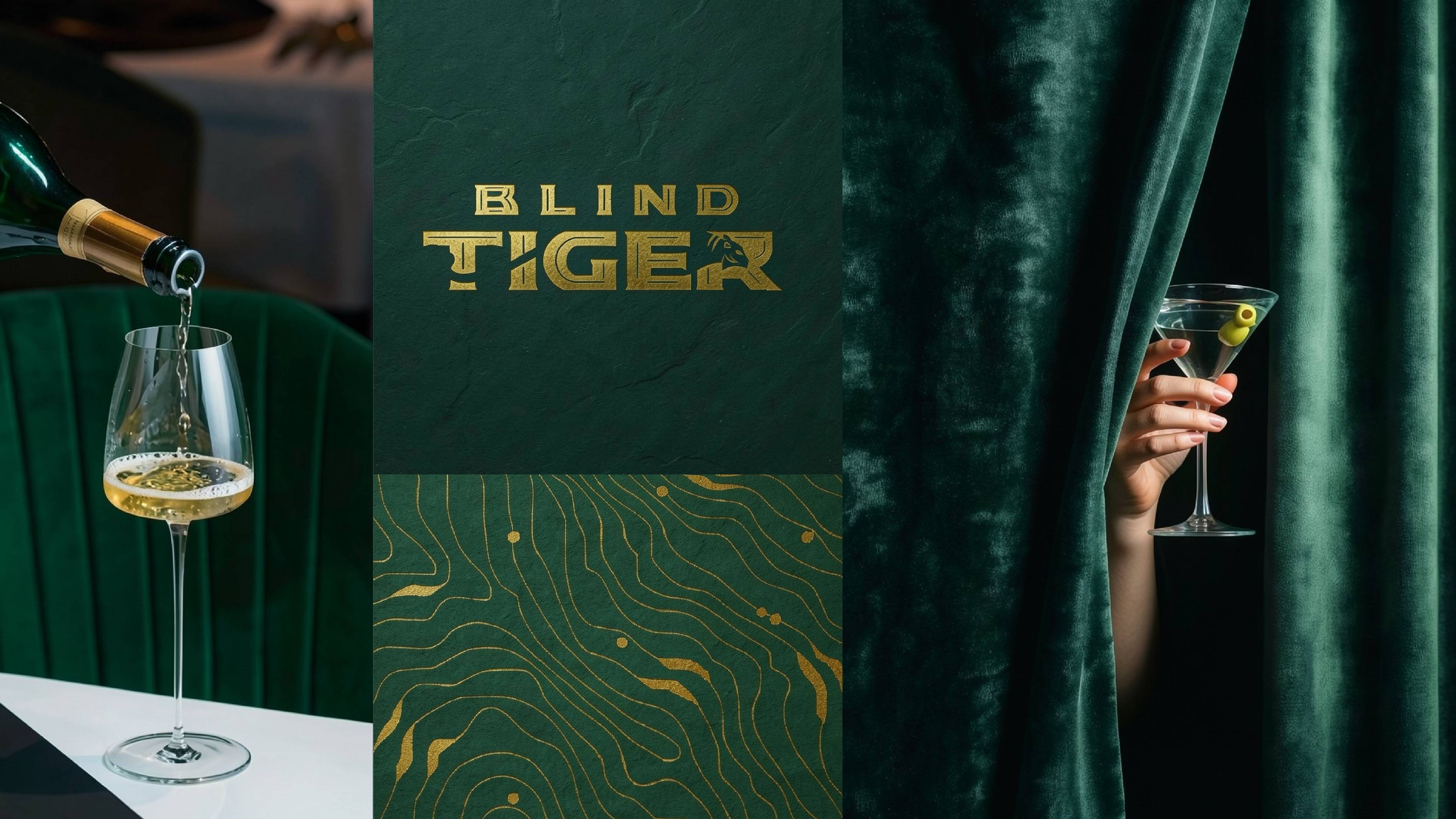
The wordmark is built like a piece of signage. Stacked. Squared. The tiger hides inside its own letters — a small pictogram tucked into the R, only visible if you slow down to look.
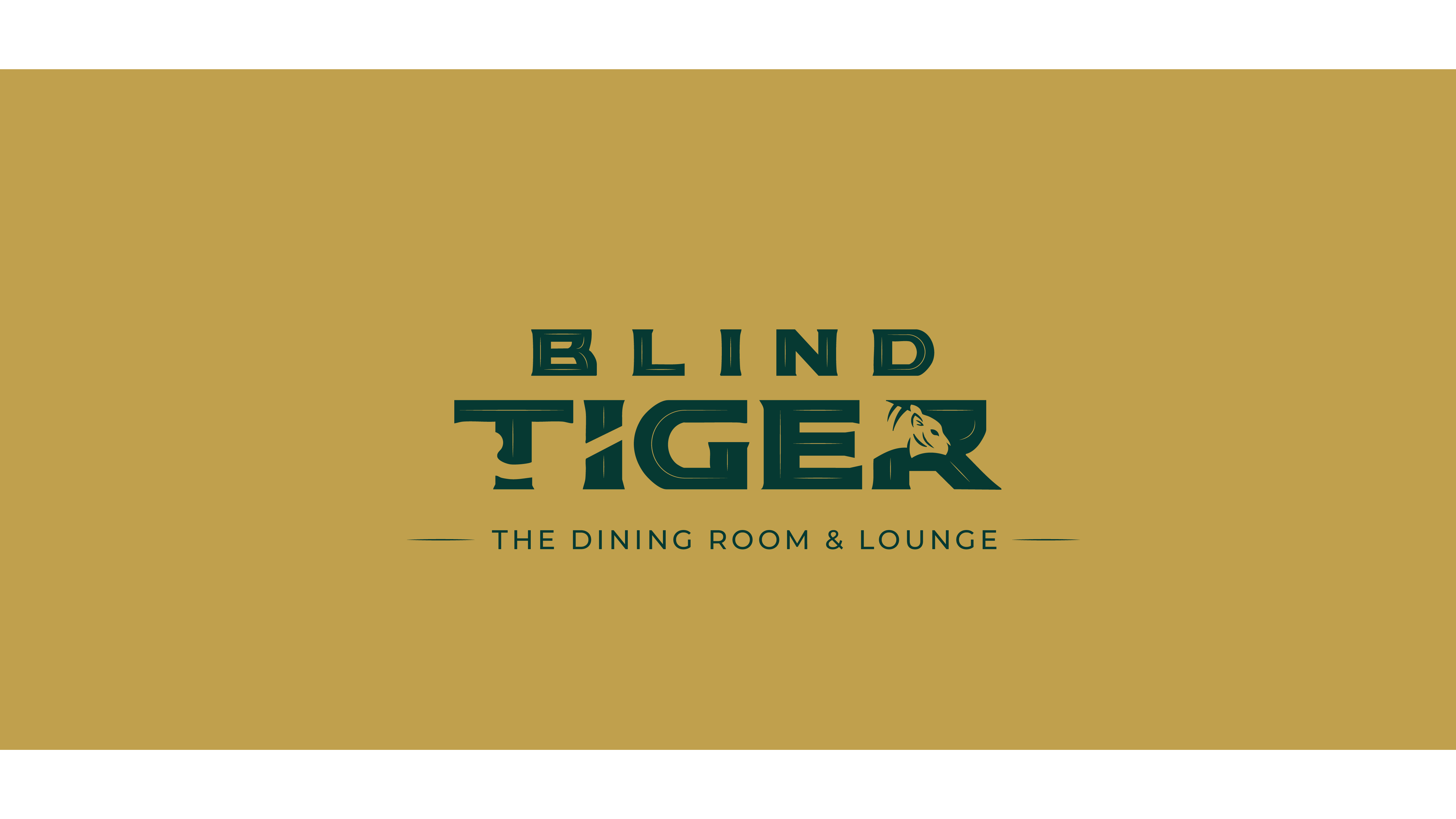
Blind Tiger wordmark in dark green on mustard ground, set with the line The Dining Room and Lounge

The Dining Room & Lounge · the line that frames the room

The mark, in one line
A wordmark that reads as a place before it reads as a logo. Stacked typography, a hidden tiger, and one consistent qualifier underneath. The dining room & lounge.
Chapter 03 Forest green & mustard gold

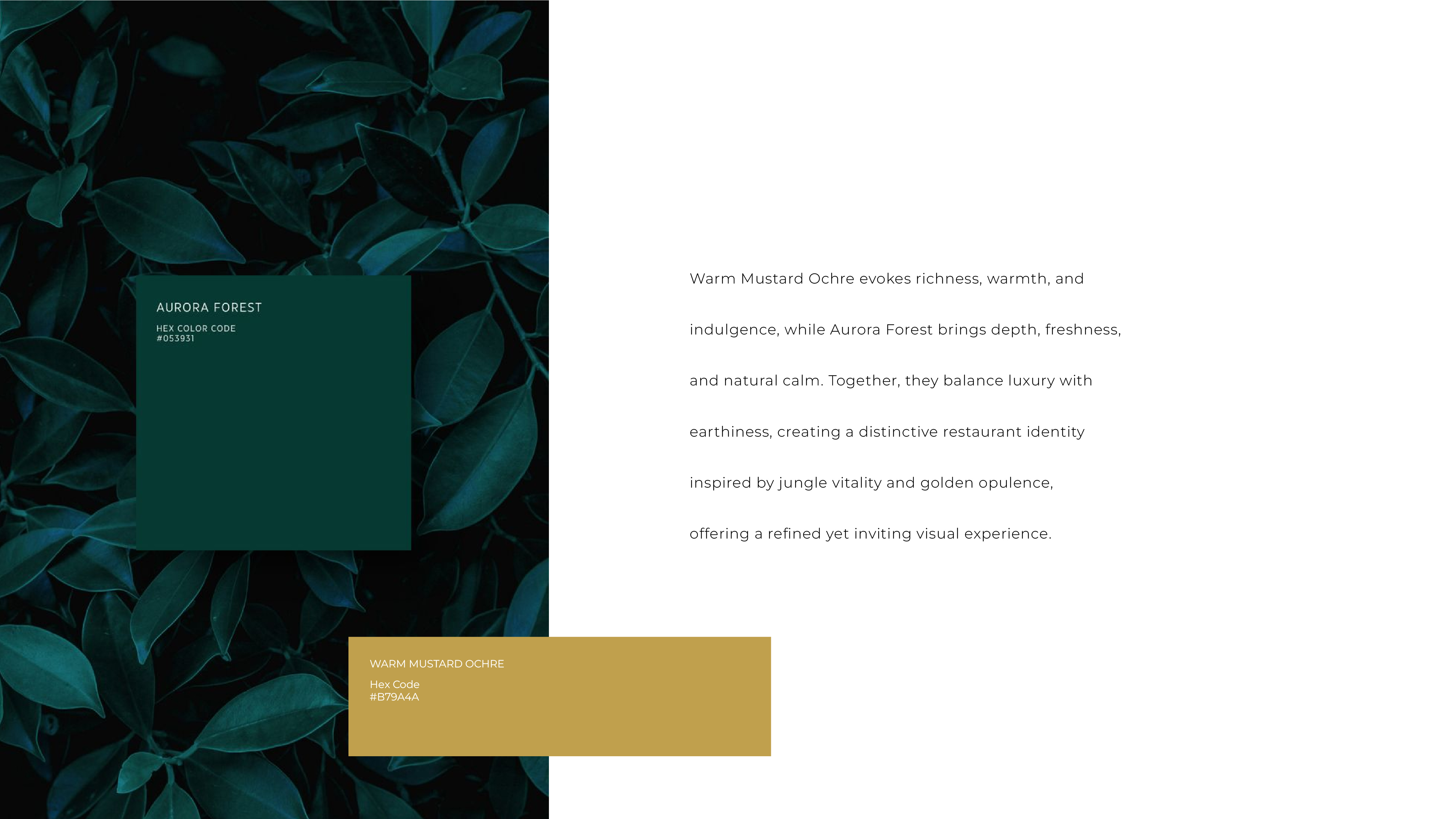
Two colours, holding the whole world.

Aurora Forest for the depth of the room. Mustard Ochre for the warmth of the light. One reads as cover. One reads as welcome.

Aurora Forest Hex · #0E3B33
Mustard Ochre Hex · #C49A3A

A pattern, drawn from the tiger.

The brand's signature print pulls from two ideas at once — tiger-skin stripes and the topographic lines of a forest floor.

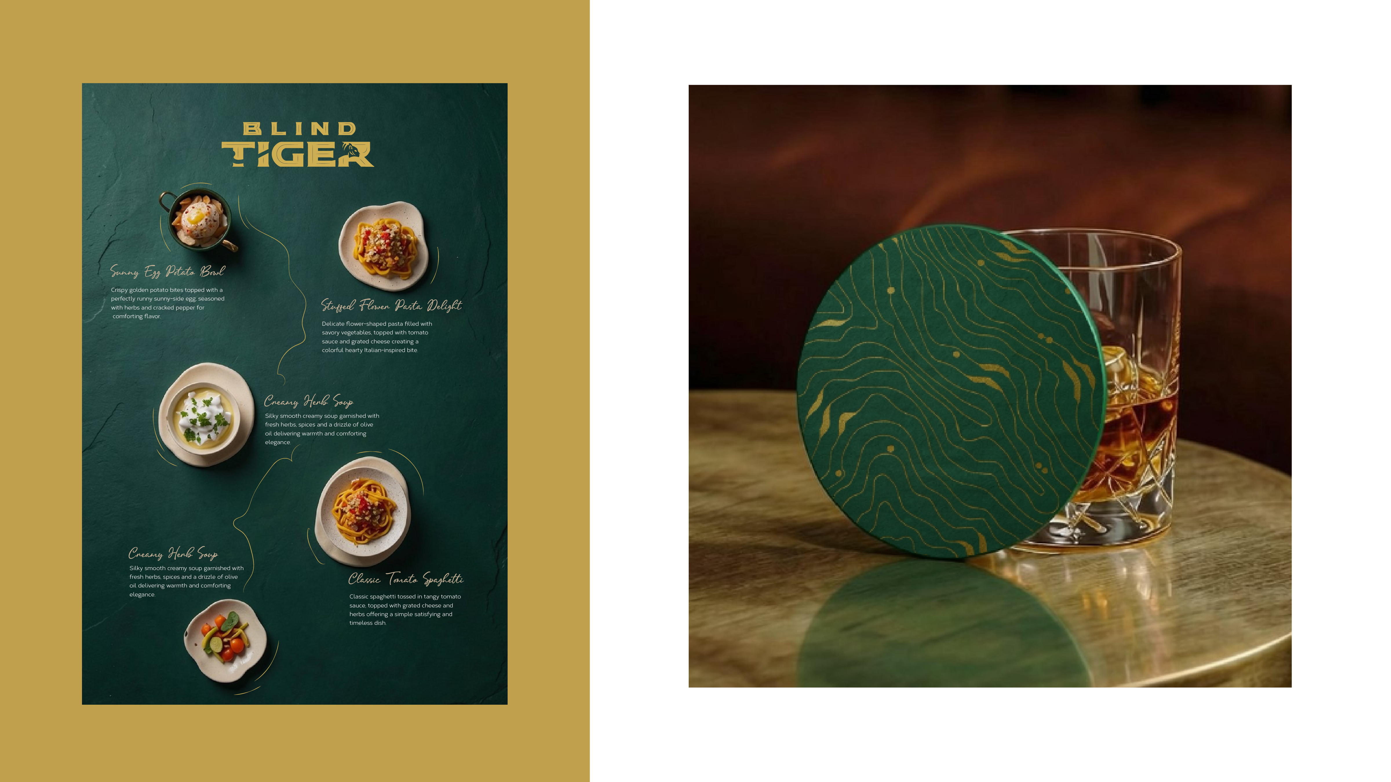
It works at any scale. A coaster. A menu cover. A wall.

One pattern, one room, one quiet idea repeated.
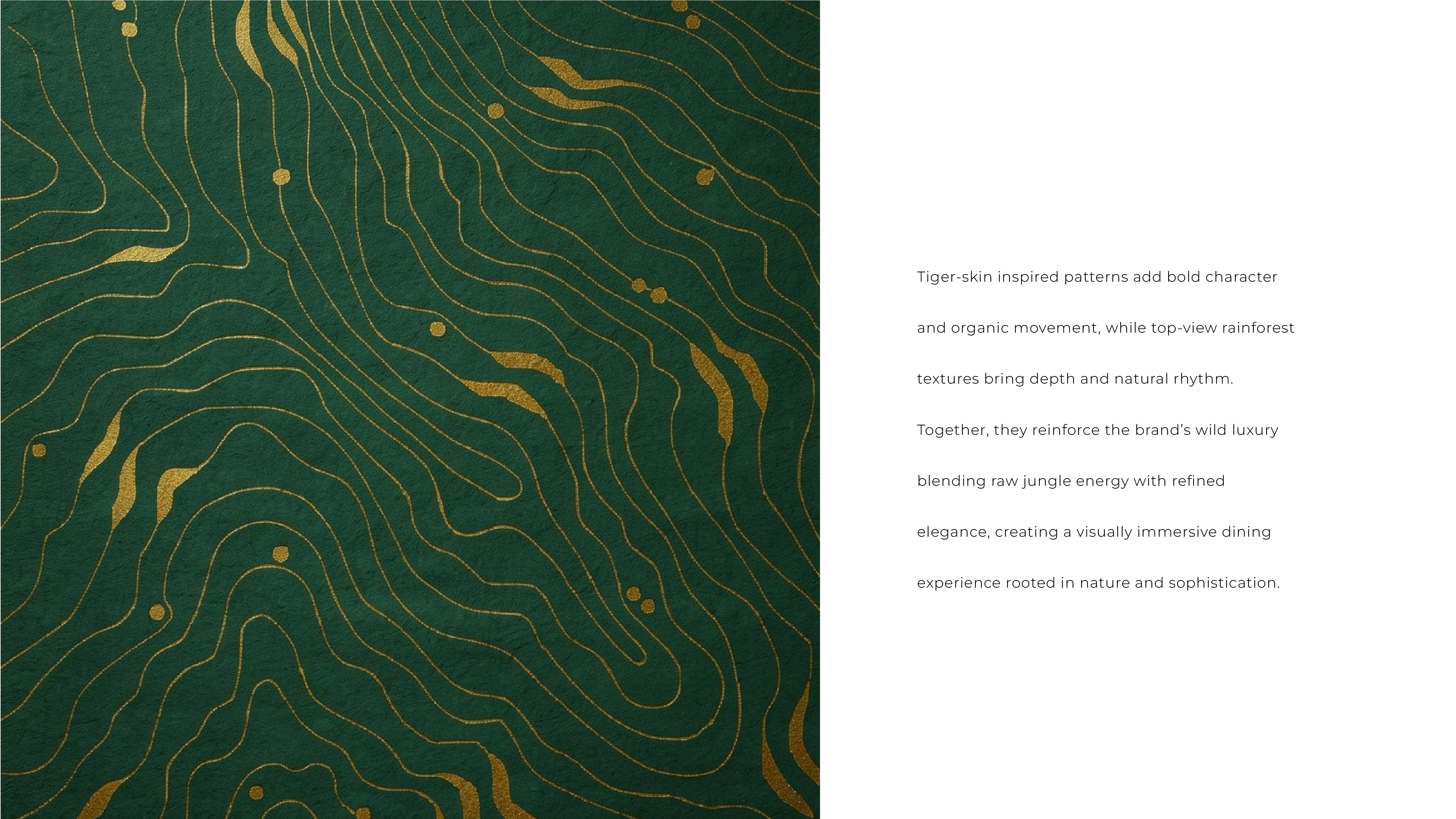
Tiger-skin topographic pattern in mustard gold on forest green
Brand colour system pages — Aurora Forest paired with Mustard Ochre

Two colours, on the page · the system that holds it together

Chapter 04 Where the brand meets the table

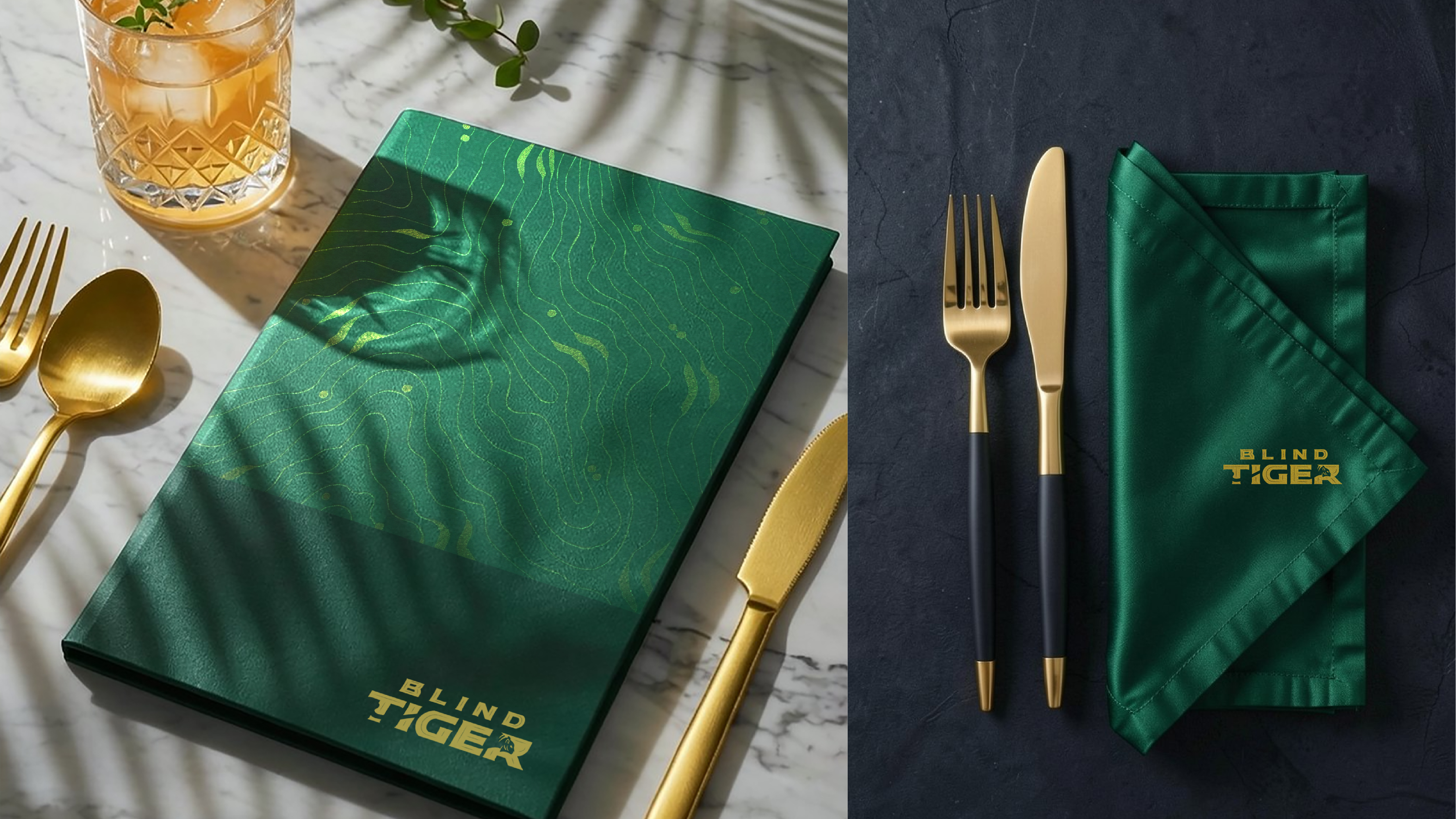
A restaurant brand lives in small things. The weight of a menu. The fold of a napkin. The coaster that stays on the table after the first sip.

Across the room

"Small things, held the same."

One identity, room-deep
A wine pour, the gold mark on velvet, and a cocktail in hand The pour
Menu cover with brand pattern, with cutlery and napkin set Menu & setting
Menu spread with dishes pictured, alongside a coaster set on a glass of whisky The menu, the coaster
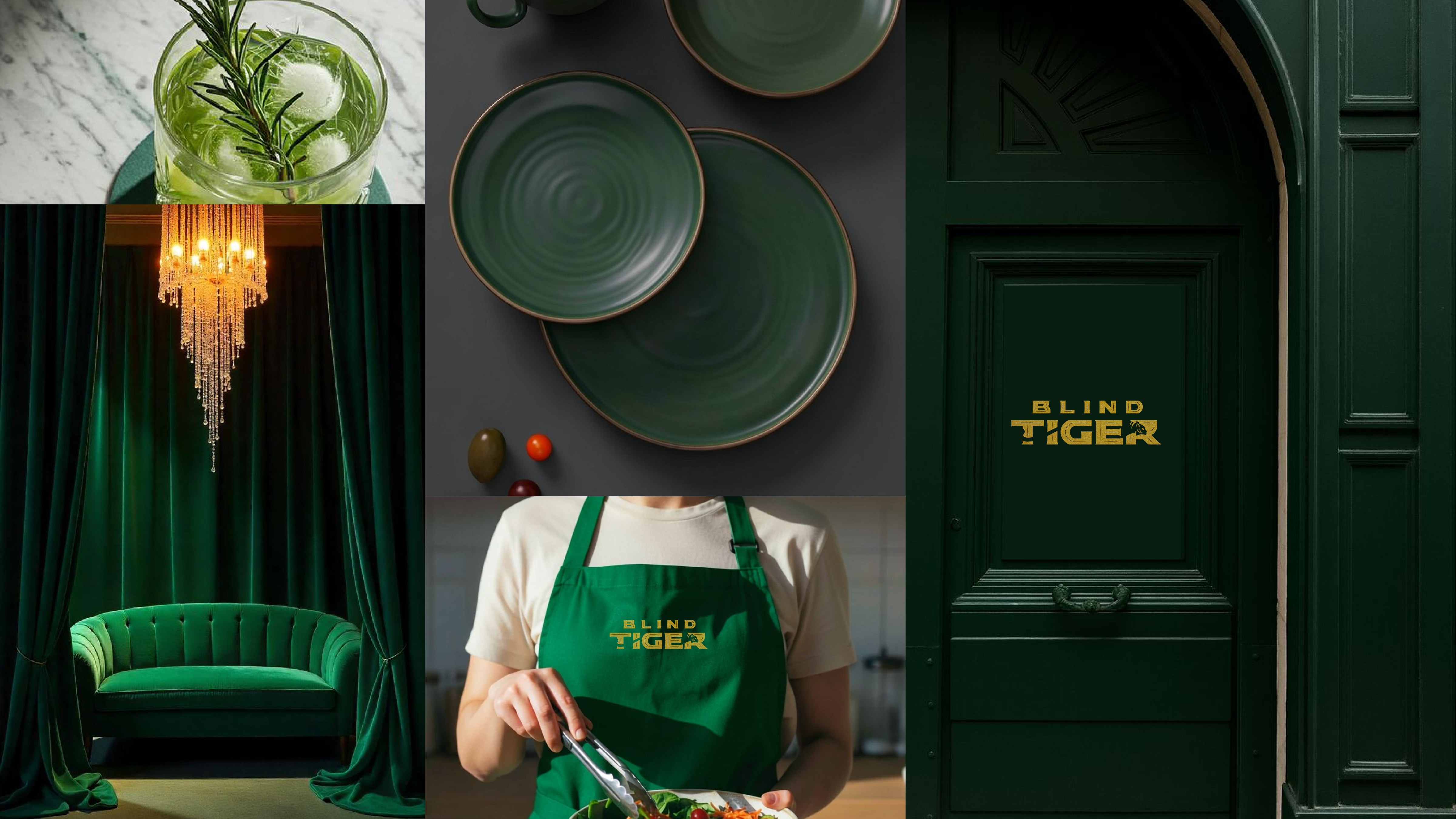
Interior collage — green velvet booth, plates, apron with logo, brand-coloured doorway The room, the apron, the door
Why it holds together
One palette. One pattern. One mark. Applied to every surface a guest will touch — without ever drawing attention to itself. The brand is the room. Not a logo on the room.
The next chapter

A name with a past.
A room with a pulse.

With love · FLUID®

Explore more

All works
Bru Cafe case study cover
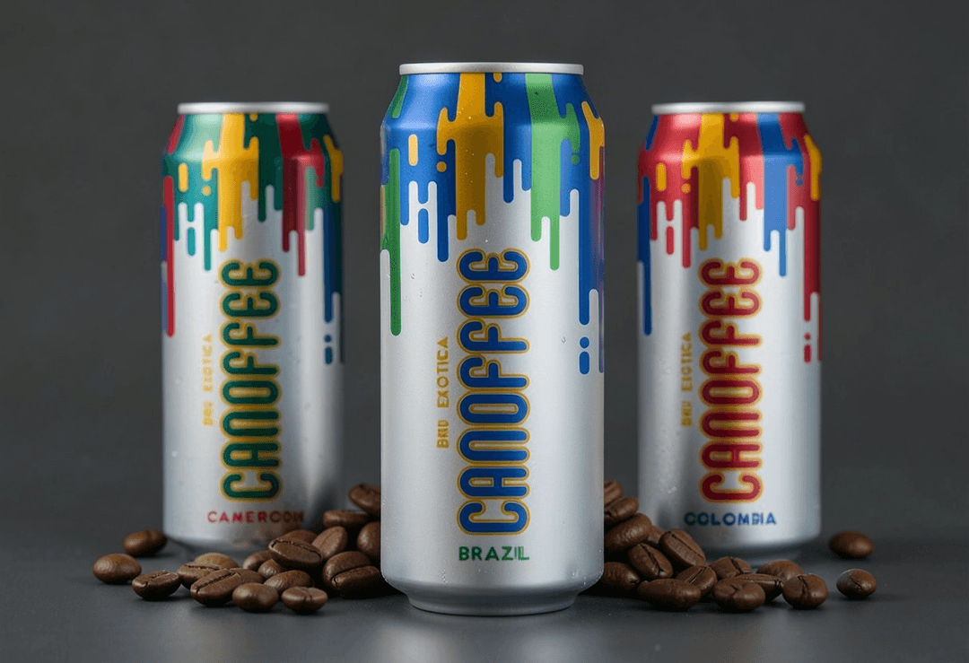
Branding Bru Cafe A coffee room, drawn from the cup.
Nembo case study cover
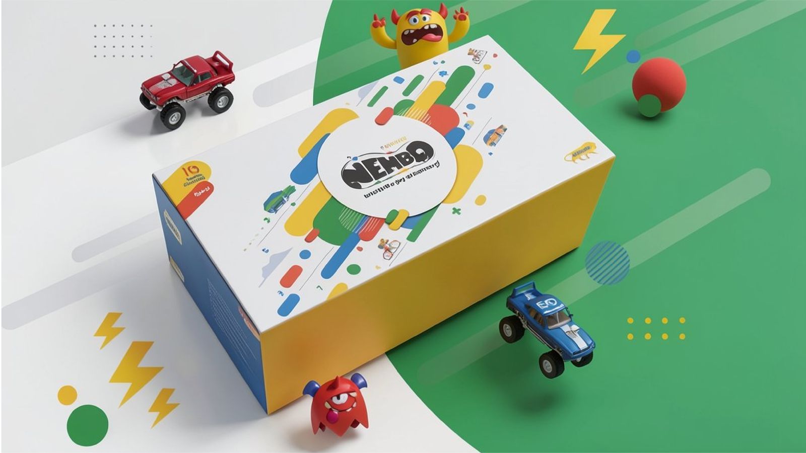
Branding Nembo An identity built around one quiet shape.